
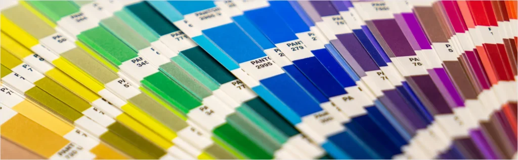
The colour of the year is a big event for all designers. One of the biggest movers and shakers of this event is the Pantone Color Institute, which has been choosing the colour of the year for twenty years! The overall announcement is preceded by an in-depth analysis of current trends, the world situation and social events that have a major influence on the selection of a unique colour. The chosen shade then affects not only design trends, but also the world of fashion, painting and life in general.
What will 2021 be like?
Colours are of great importance in the human world. In addition to the aesthetic effect, they also affect the psyche – for this reason, not all shades are suitable for every part of the interior. In 2017, for example, the energetic green was chosen, which was replaced by the magical ultraviolet a year later.
For 2021, the Pantone Color Institute has selected two colours. Bright Yellow (Illuminating Yellow – Pantone 13-0647) and Neutral Grey (Ultimate Grey – Pantone 17-5104).
Hope symbolizing the colour yellow
Yellow is probably the colour most people immediately associate with sunshine and warmth. It is coincidentally considered a symbol of abundance, happiness and hope in Eastern cultures. In addition to its warming effect, it also encourages appetite or creative thinking.
Bright yellow is a great colour for poorly lit rooms or those facing north or east. It also fits perfectly in living rooms and dining rooms.
Beware of its quantity!
If you decide to decorate your interior with yellow, be careful not to use too much. If you do, it can cause bad moods, anxiety and frustration. Therefore, always use it with caution and in combination with colours that can tone it down.
Hardiness hidden in neutral grey
The colour grey is considered boring and conservative by many people. However, from a design perspective, it is a versatile shade that can be combined with almost anything.
From a psychological point of view, qualities such as strength, bravery or endurance are attributed to this colour. However, large amounts of grey can cause insecurity or sadness. For this reason, it is very important to handle grey with care.
Grey is great for spacious and bright interiors. In this case, it is suitable for floor or wall painting. In smaller apartments, it is better to use it for accessories.
What to combine grey with?
Grey should never stand alone. To balance it out, colours like white or the aforementioned yellow should be used!